3.12.09
Introduction
Pixel hostel is a scrap book of images and thoughts. It is the second blog William Harbison created for his masters project. Pixelhostel is an off chute of the initial HarboProject blog, for useful and interesting data which didn't get properly published into the HarboProject blog.
www.pixelhostel.blogspot.com
www.harboproject.blogspot.com
www.pixelhostel.blogspot.com
www.harboproject.blogspot.com
2.12.09
poster text
www.anexarchitecture.blogspot.com
AneX depicts a built environment capable of fine grain and large scale changes without disturbing ongoing uses. Designed for future extension, renovation, downsizing and reuse.
A network of networks is carried within the primary structure. enabling services to extend as the building does.
The structure is designed to reach seven stories, aiming for a paris and barcelona level of density for adelaide. This height allows sunlight to reach the streets.
Low density - rural
A free standing home
The same home
Grown and adapted
When there is no free land aneX builds on top of other buildings. this could be and extension or new neighbours moving in above you.
Homes of all sizes
you can start with a single bedroom home and keep adding untill you have enough room for your whole family. When your kids move out you can even sell part of your house without selling your home. aneX makes downsizing simple, environmentally friendly and economically sensible.
Mini-crane
The light weight composition of aneX is less depended on heavy machinery. All but the primary structure can be carried by hand.
FRANKLIN STREET
MORPHETT STREET
north
SUNNYS BACKPACKERS
William Harbison
Masters of Architecture
Adelaide University 2009

1.12.09
29.11.09
25.11.09
poster dissection
symbols
images
messages
text
brief
the poster is 1682mmX1189mm
the large scale enables readings from various levels
reading levels can be divided in 3
- first level / impression viewable from 6 to 3 meters, information is symbols greater than 30cm
images
messages
text
brief
the poster is 1682mmX1189mm
the large scale enables readings from various levels
reading levels can be divided in 3
- first level / impression viewable from 6 to 3 meters, information is symbols greater than 30cm
- second level- viewable from 3 to 2 meters, information is symbols greater than 5cm
- third level / information - 2-1m view, symbols of 1cm become viewable.
- forth level / fine detail- 1m-20cm, symbols of 2mm become viewable.
what images/symbols/text will be on my poster?
- third level / information - 2-1m view, symbols of 1cm become viewable.
- forth level / fine detail- 1m-20cm, symbols of 2mm become viewable.
what images/symbols/text will be on my poster?
1.first level / Impression Message
-Hero Image
-title
-title
- information
- building system - not just one building
- modular
- growing -aneXing
2.second level = Main Message- state of the art comes standard
- subtitles/ slogans - pushes the ethical position/ identity
-mass production - human power - reuse
- diagrams of the important characteristics
-anatomy of the system
-process of construction
-information requires the connection of 3-4 neatly grouped symbols
- Information
· Modular Prefab building system
· Communal super service structure - structure and services in 3d Grid
· Flatpack - human scale – easy cheap transport
o Reduce reliance on cranes & trucks
o Affordable
o Human empowered
· Plug’n’play components - Easy install – no specialists needed - no skilled labour required
· Client/user choice
2. third level = Secondary message- unique beyond standards
-information requires the connection of multiple symbols which may be separated and referenced or connected by call-out arrows
-detailed renderings of individual dwellings,
-standalone (walk around) -low density, 1-3 stories
-row house (walk to) -medium density, 2-3 stories
-parasites (walk via) -increasing medium density, 1-6 stories attached` to another structure
-dense mix (walk up/lift assist) -high density. 6 stories
- information
· Affordable and extendable - mass production
· Density variable
· Location variable
· Narrative driven form - user generated outcome
· Zone rules create community patterns
· Users interact via catalogue/ store
· Reusable –Interchangeable prefab components
· Easy recycling
4.Forth level Sub messages- standards for all
- subliminal messages, artifact placement
- information is implied through depiction of theoretically a lined products and well known cultural symbols.
- gives a sense of realism and living inhabitants to the representations. e.g. grafiti, bikes, trailers, green walls, wind turbines, solar panels, water tanks, signs of degeneration (DEATH), signs of life (lights, flags, stickers, posters, birds, drama, trash, rubbish, ware & tear, obstructions)
- information
· Expanding the client base of architecture
· Architect as a broadcaster
· Integrated two way networks – water and power harvesting
. new building materials - hemp
· Most houses are not designed by architects
· Houses usually overcrowded and under-utilised
· Normal buildings go to landfill
24.11.09
22.11.09
Lifecycle Building Challenge 2007 Student Building Winner : groHome


Submitted by: Adam Fenner, Jason Bond, Thomas Gerhardt, Josh Canez, Nick Schaider
College Station, TX—A team of students at Texas A&M University, 2007 Solar Decathlon Team
http://www.lifecyclebuilding.org/2007/gallery-detail.php?EntryID=84

20.11.09
19.11.09
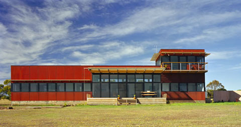
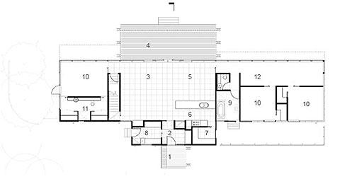
Bells Beach Modular House
"Bells Beach Modular House
Design Philosophy
The Bells Beach Modular House is a prototype of our exciting prefab concept. All building materials adhere to a strict 300mm module such as 1200mm windows, 600mm internal floor pavers, 1200mm external steel cladding and 2400mm strawboard internal wall lining. This allowed use of standard-size off-the-shelf materials, lowering cost and minimising material wastage.
It is a linear house, oriented to capture the northern sun for maximum passive solar gain. The robust form blocks cold south-westerly winter winds but opens up to capture cool southerly summer breezes. The rusty red Cor-ten cladding reflects the red cliffs of the Surf Coast and requires no maintenance in this harsh environment. The building is raised off the ground to take advantage of the 360-degree views of the sea and countryside."
-thanks to zenarchitects
via busyboo.com

“1K” (1 room + a kitchen)
 "Many apartments in Tokyo take this form - the so-called “1K” (1 room + a kitchen)"
thanks pingmag.jp

New York City's 10,000+ street vendors ; Making Policy Public


"As part of Making Policy Public, Candy collaborated with The Street Vendor Project and the Center for Urban Pedagogy (CUP) to research, compile, and design this guide to street vending in New York City."
check it out thanks to candychang

17.11.09
Callum Morton

Motormouth 2002
Architecture is the medium of Morton’s work. His models go beyond the architecture. The architecture becomes a symbol upon which wider sensations can be realised. The content of his work is the way in which the viewer observes and responds to his installations. The subversion Morton achieves is bringing highways into the galleries. Out of scale and out of context the audience relates to Morton’s work in ways which are impossible in reality.
image thanks to www.artgallery.nsw.gov.au/

‘The Meeting Place’ by ASPECT Studios

Taking what is already there and making it more relevant, it becomes important and is valued. His ‘the meeting place’ in Sydney 2009 does just that. Interactions which previously would never have occurred become the focus in this new space. the space makes its inhabitants more relevant to each other. In an inspiring way individuals become conscious of themselves, observing values in themselves which may have previously been invisible.
thanks to thegrafikmuseum
more at lanewaysbygeorge.com.au

16.11.09
Subscribe to:
Comments (Atom)


 http://fc07.deviantart.net/fs17/f/2007/224/7/b/yoruichi_bending_over_by_bake.jpg


